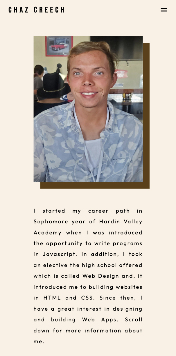
Portfolio Website
The Objective
Requirements
Design and develop a portfolio website which is simple enough for viewers to see my whole gallery of UX and front-end development work such as projects for a certification program, projects for a client, and projects made simply for fun. This website is a way to brand myself to the whole world for the people to know all my skills for any kind of software design combined with development.
Design the portfolio website using Figma in a way that responds to a few different screen sizes by restructuring the layout of the content. This project requires the utilization of HTML and CSS including a little bit of JavaScript for any complex interactive elements. Additionally, I need to choose a color scheme for the sake of the attractiveness of the site. The appearance of the website will draw inspiration from the portfolio website of Penny Banks. As I write the HTML/CSS/JavaScript files, I need to utilize GitHub to commit changes to the files in the repo.
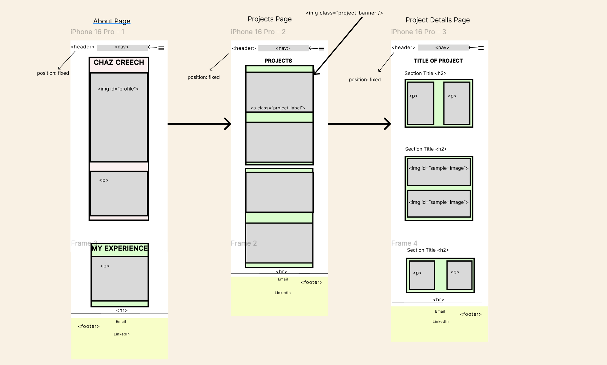
Figma Wireframes
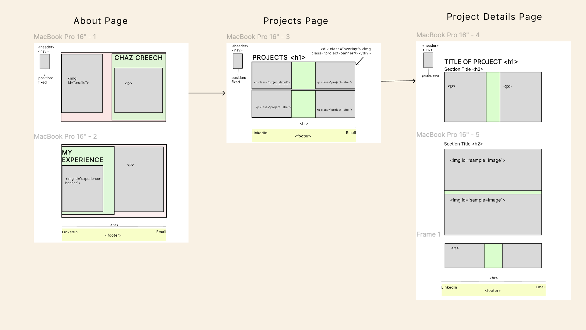
Macbook Pro
iPhone 16 Pro
For the screen size of a Macbook Pro, I used a lot of grid layouts to organize the content of the pages in the most attractive way for users. In this type of device, including other desktops, the header consisting the nav bar is placed on the left side of website.
For the other screen size, the iPhone 16 Pro or any other smart phone device, all content in the grid layouts are organized in a way the content is stacked vertically except the grid layouts in each project page. The reason I didn't restructure the content on every project page because I don't want the users to keep scrolling down the content on their phones until they might get bored enough to exit the website. The header and nav bar is placed at the very top which stretches from left to right. The header would also become an interactive element revealing the nav bar when the nav bar icon is clicked for the sake of simplicity.
The Development Phase
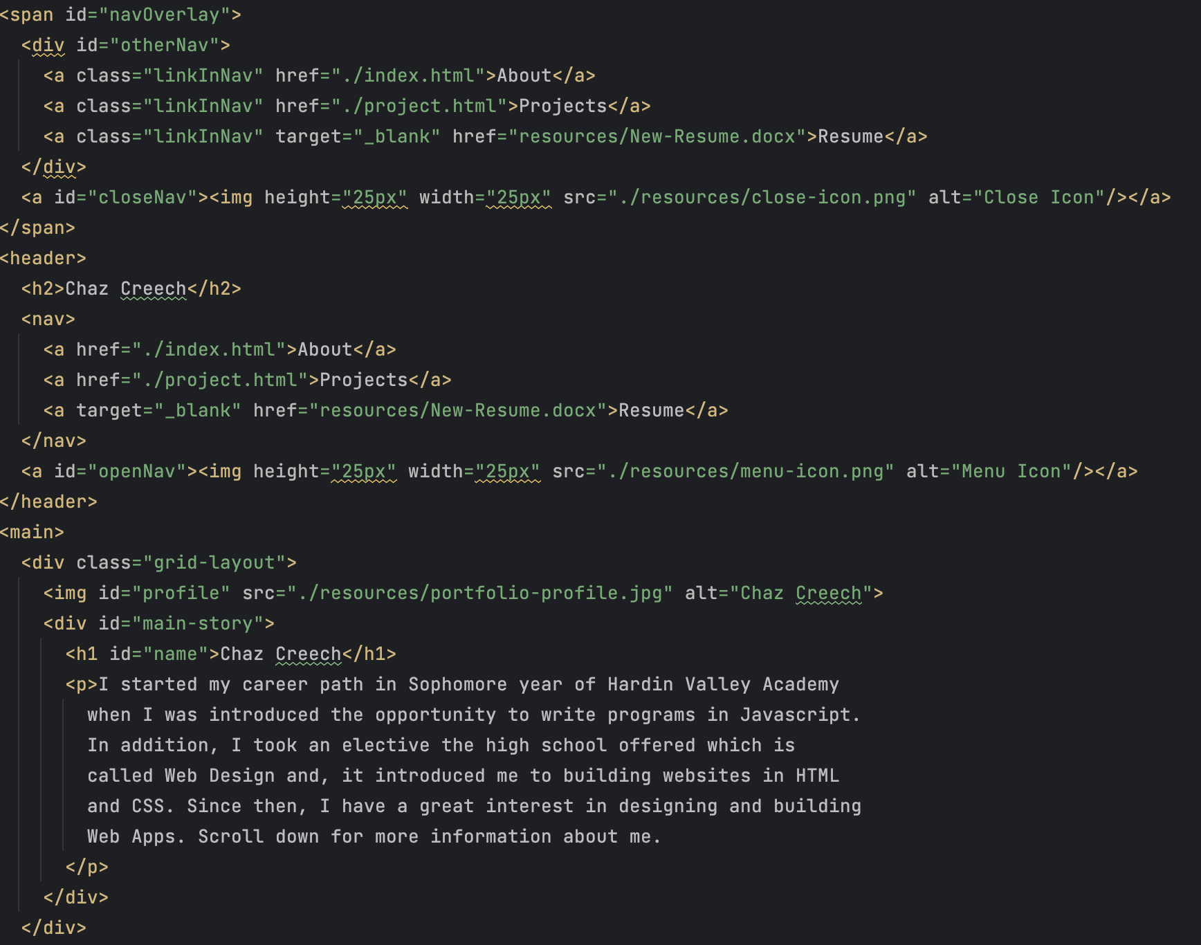
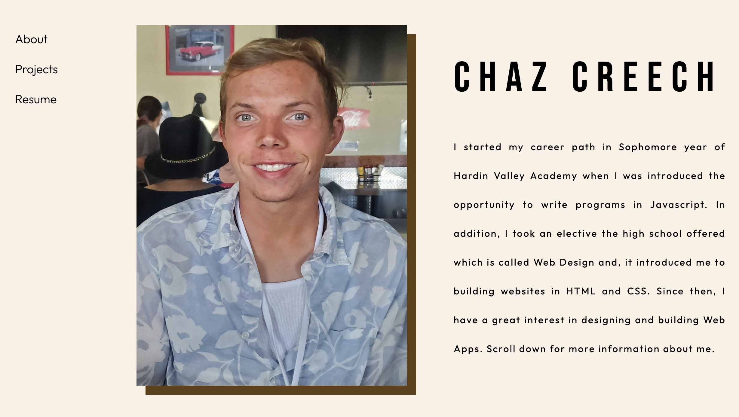
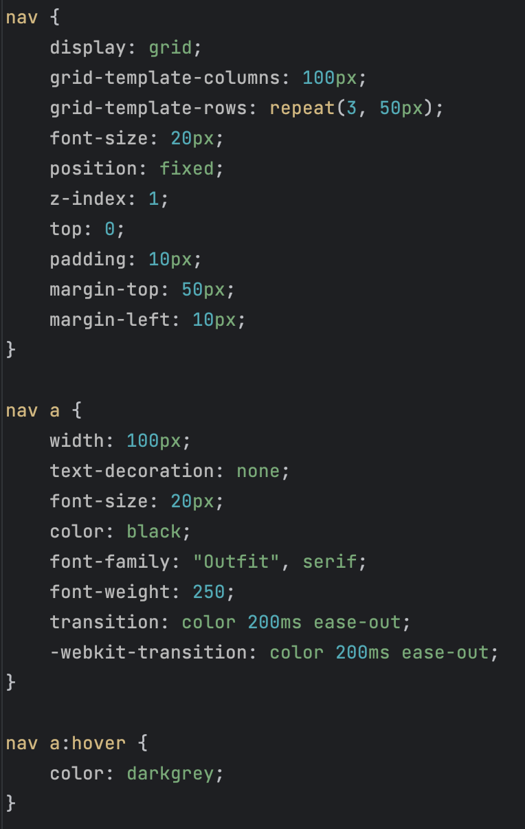
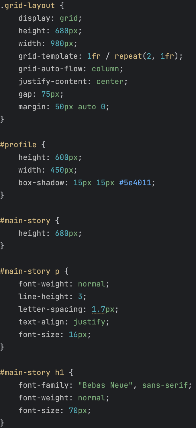
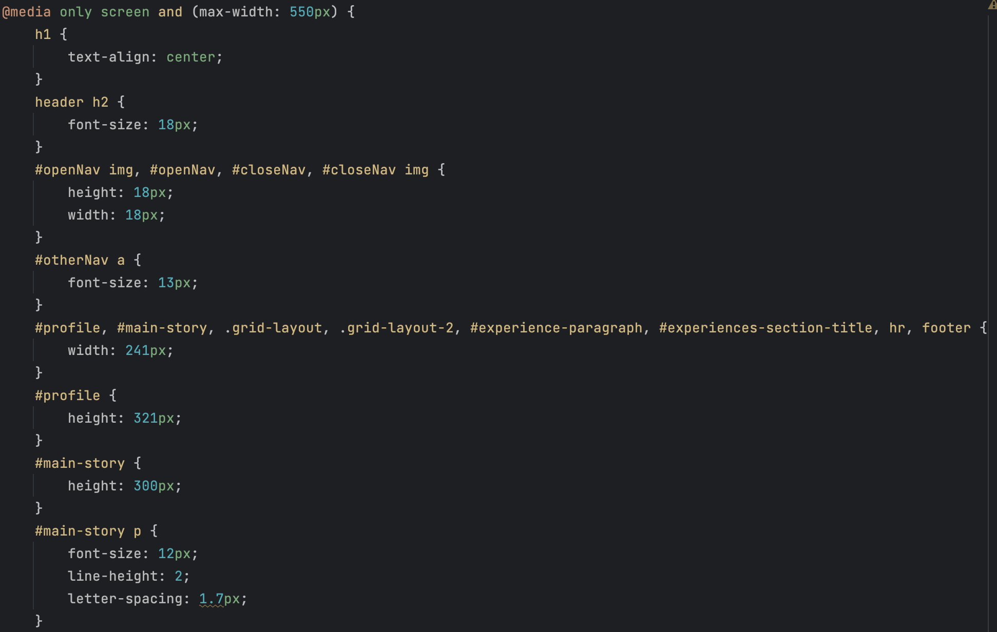
The following is a sample of how I developed the top part of the About page: